
Pure CSS 3D Animations Learn how to use CSS Perspective, Perspective Origin & Transform-Style to make awesome animations!

I am a Frontend Developer and Designer and I am the founder of Island Web Design in Guernsey. I love blogging about my experience and I hope my blogs can help people who like me, want to start a web design business and need some help along the way.
Island Web Design is always Available for Work
https://islandwebdesign.net/
jordan@islandwebdesign.net
Intro
CSS is a very controversial topic, especially on Twitter. Everywhere I look people are engagement farming asking questions like "Who still uses vanilla CSS?" and "Should I learn Tailwind before knowing CSS" or even better, "Why is CSS so hard?" Not to worry I am here to help, CSS has always been one of my favourite "languages" (I use that term loosely) to build cool things because when you know what you are doing there really are no limits.
I recently posted an awesome 3D CSS animation on my Tiktok and people want to see the full process, so here it is. In this article, I am going to explain in full detail how I made that awesome cube animation that you see above.
We are going to be using CSS Perspective, Perspective Origin and Transform-Style, if you aren't familiar with these, that's fine because I'm going to teach you.
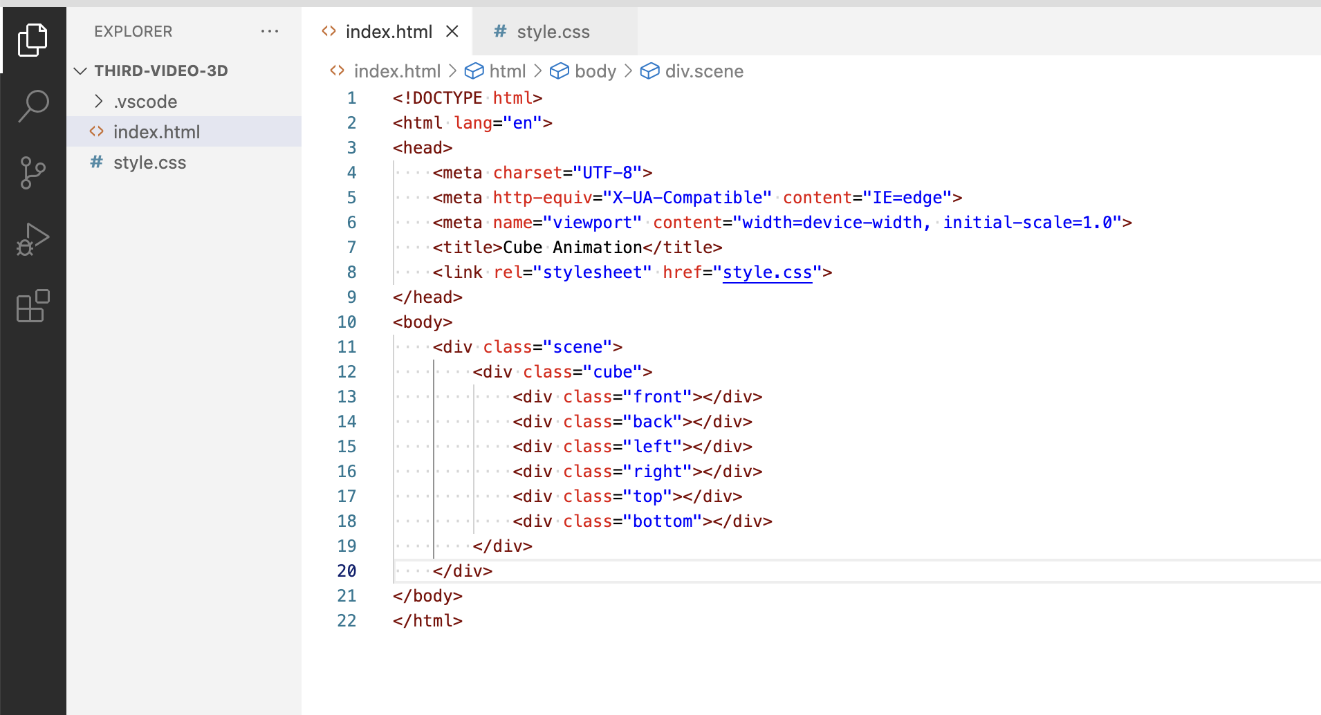
The Html Markup
The file structure for this project is as simple as it gets, all you need is "index.html" & "style.css" (takes you back right? I can't remember the last time my files were this simple!).
The markup is fairly simple, inside your body you want to create a div with the class name "scene", then inside that create another div with the class name "cube" and inside that you want 6 divs, one for each face of the cube, each with a class name based its position eg front, back etc.
CSS
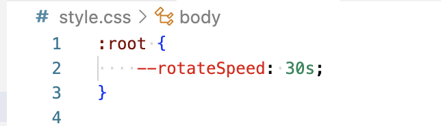
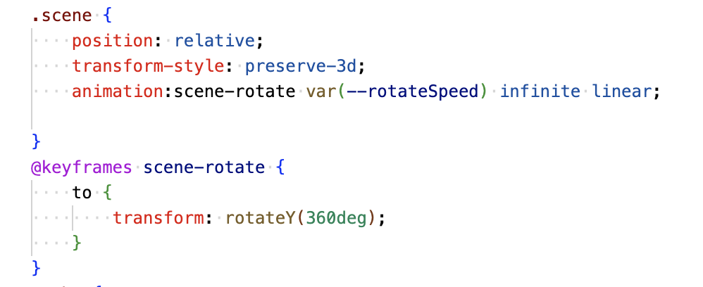
Now for the fun part, the styles! Starting with the root we create a variable with the name "--rotatespeed" so we can use it later on to animate the scene.
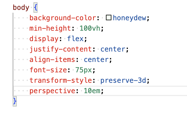
Next we add some basic styling to the body, we add a background-color and we use flexbox to make sure our content remains centred along with a min-height of 100vh to make sure the body takes up the full height of the screen.

Next, an important thing to remember here is you want to put a font size on your body of 75px. The reason for this is we are going to be heavily relying on "em" measurements and as I am sure you know, "em" measurements are relative to the initial font size set on your body or root element (unless overridden by a font size set on a containing element but we don't need to worry about that here).
Now for the most important styles. First, you need to make sure you put "transform-style: preserve-3d" on your body. This is extremely important. When I was first learning 3D Css I couldn't for the life of me work out why it wasn't working, turns out this was the reason.

Now for perspective, if you want a full rundown of how perspective works you can read about it here https://developer.mozilla.org/en-US/docs/Web/CSS/perspective but in short, it is effectively the distance between the Z=0 plane and the user. I normally find the lower the better, but I would recommend you play around with this to see what works best for you. I use 10em.
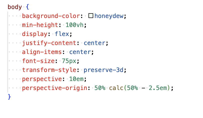
Now the next step isn't exactly necessary but I always like to add this one as I find it just looks better, the decision is ultimately yours though, so have a play around and come to your own decision. I add "perspective-origin: 50% calc(50% - 2.5em). If you want to learn about CSS Perspective Origin you can read more about it here. https://developer.mozilla.org/en-US/docs/Web/CSS/perspective-origin In short, it defines the position at which the viewer is looking at the scene and the position of the vanishing point.
The next step is the styling for the scene, it is pretty self-explanatory, I use "position: relative" so everything can be positioned absolutely inside of it. Then I use "transform-style: preserve-3d" again for the reasons I mentioned earlier and I also add the animation to get the scene to rotate using the variable I created on the root element at the beginning.
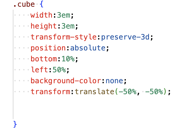
Next, you want to add your styles to the cube, a lot of the stuff you will see here is self-explanatory. We are just making it equal in width and height and positioning it absolutely using left and bottom percentages and "transform: translate" to centre it inside the scene. We do not give the cube a background colour as it will not be visible in the final product. Don't forget to put "transform-style: preserve-3d" on the cube.
Now for the left, front, right and back sides. We use "position: absolute" to put them all into the same place and we set a width and height of 100%. I recommend adding an inset box-shadow here to make it look more real. We also add opacity for the same reason we have used a rotating animation on the scene, it just makes it easier to perceive the 3d and understand your positioning.
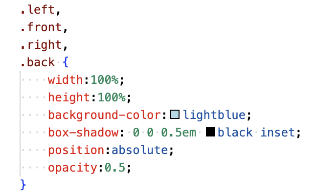
I ended up putting a width of 3em on the left and right sides just because I was having issues with sizing and I wanted to be sure they were the correct size.
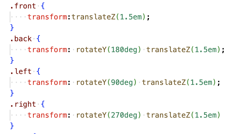
Now comes the actual creation of the cube. I won't explain too much in writing here because I believe you will get a better idea from just seeing the code, but you just use "transform: translate" & "rotate" to position each side of the cube in the correct position. Like this.
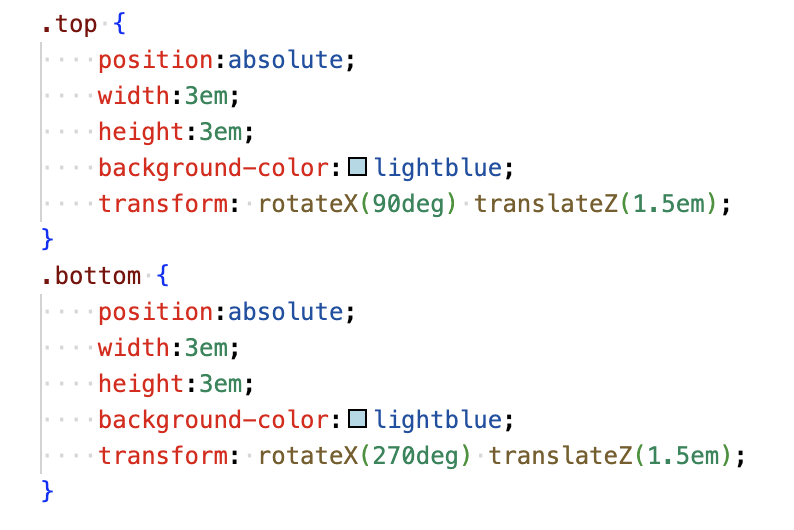
You now do a very similar thing with the top and bottom, like this.
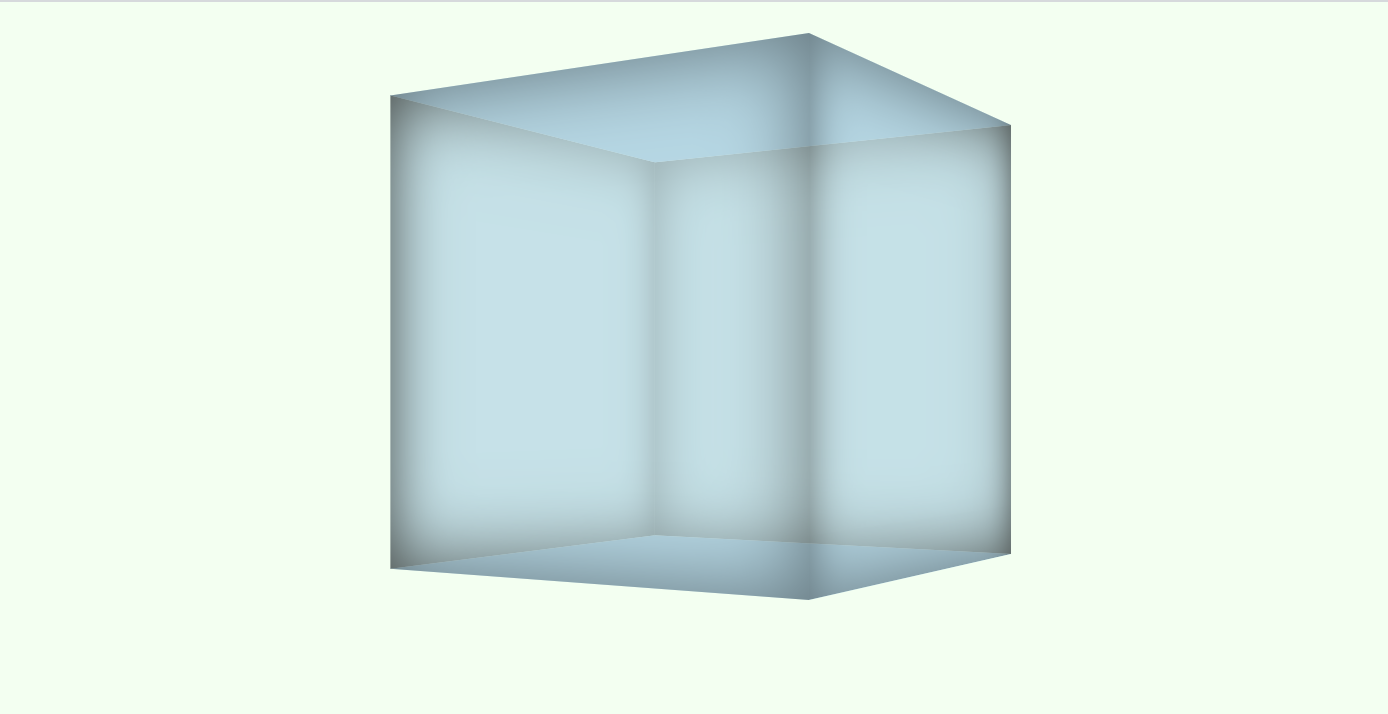
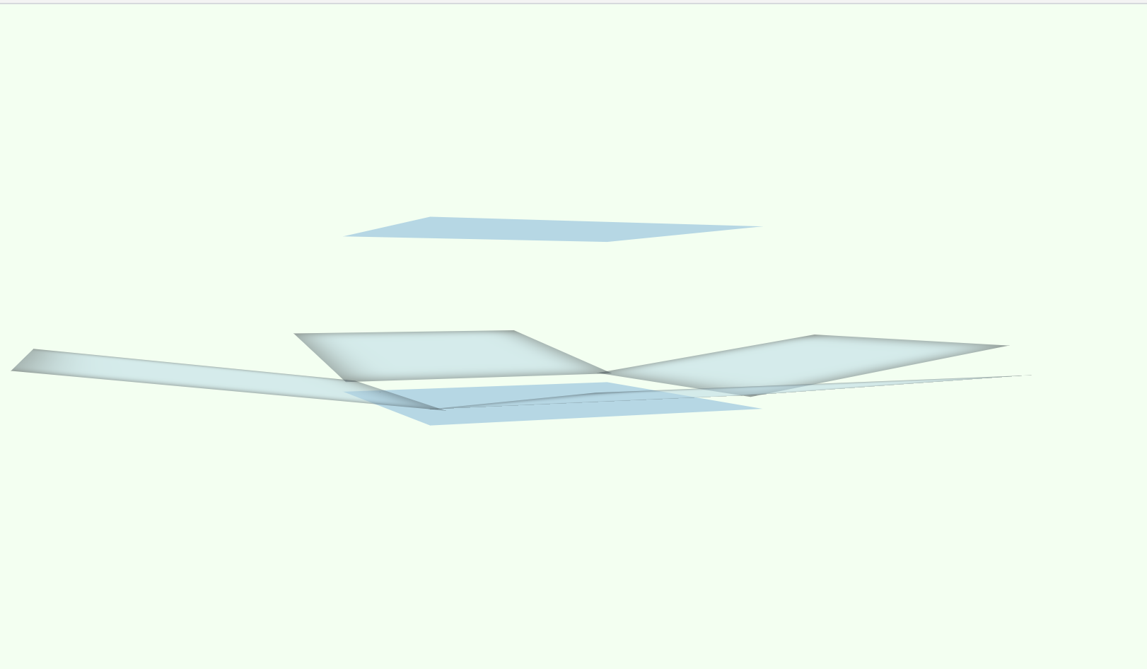
Before we get into the animation, this is what you should have right now.
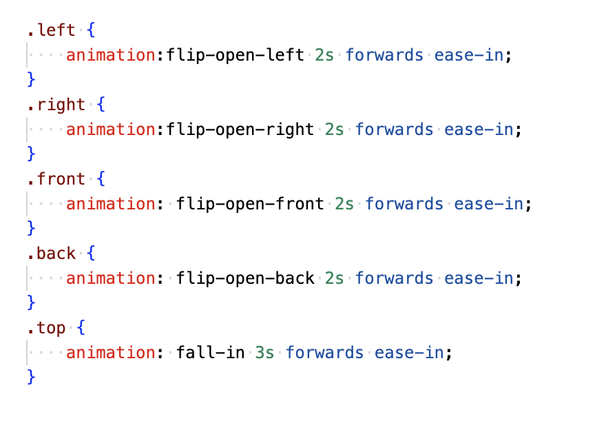
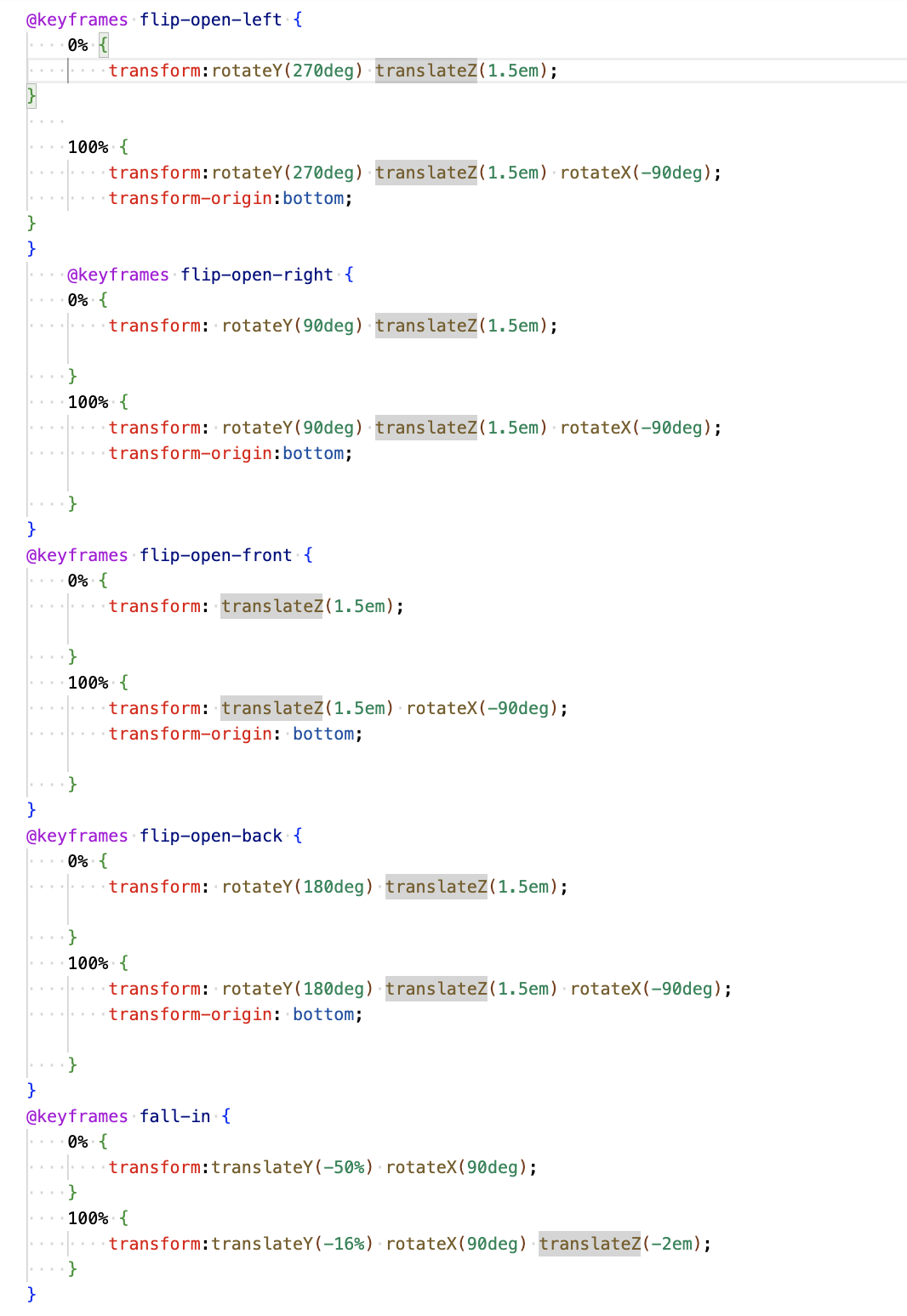
Now with the animations, like before, I won't explain too much and I will let the code do the talking, but a few things to remember are, you need to use "transform-origin:bottom" on the sides, because without this the transform originates from the middle and you do not get that opening effect. You also need to make sure you use a "0%" or "from" value in your keyframes along with a "100%" or "to" value. This is because you have already transformed and moved the sides so if you didn't include this "from" value the animation would start from the side's original position and not where they are now.
If you want to see the video you can check it out here! Unfortunately Hashnode won't allow me to add videos to this blog sorry!
https://www.tiktok.com/@jordanislandwebdesign/video/7193797673852456197?lang=en
Outro
So that's it, that's how you can use Pure CSS to make awesome 3D animations. If you want to see more like this make sure to subscribe to my newsletter here on my blog and go and follow me on Tiktok where I release videos like this daily! https://www.tiktok.com/@jordanislandwebdesign?lang=en
If you would like to hire me for a Web Design & Development project or Digital Marketing or Seo then you can check out my website here: https://islandwebdesign.net/
jordan@islandwebdesign.net


