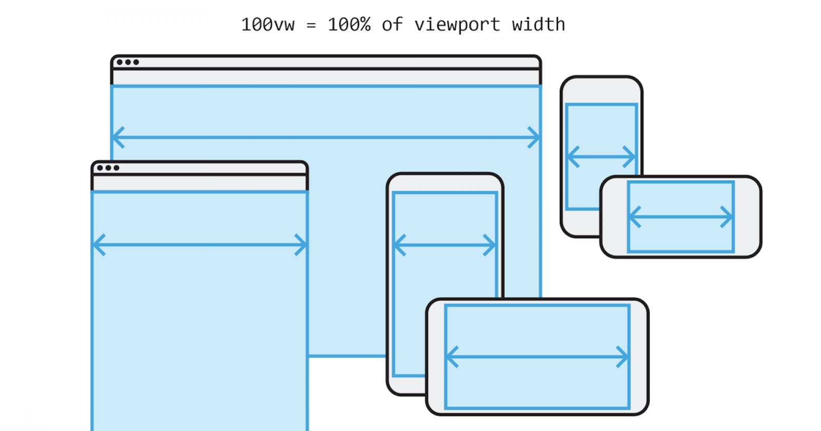
Why using VW and VH viewport measurements in CSS can be dangerous


Table of contents


No headings in the article.
When I first started as a Frontend Developer, I like many others were taught early on that using viewport width and viewport height measurements was a very convenient and widely practised way of achieving responsive design. I used to use viewport width and height in pretty much every design, whether it was to make the body the full width of my screen or to size elements in a way that made them grow and shrink with the viewport.
I no longer use vw or vh ever and in this short blog post, I'm going to explain why in my opinion it can be dangerous.
I recently landed my first client and I was so excited to jump in and build this website for them as I knew that I had completed the hardest hurdle of starting a Web Design Business, getting that first client.
After many, many hours, and many, many redesigns I finally had the website complete and as this was the first time I had made a website that was going live on the web to be used, there were a lot of new things I needed to learn compared to when I was just building personal projects that no one was going to see.
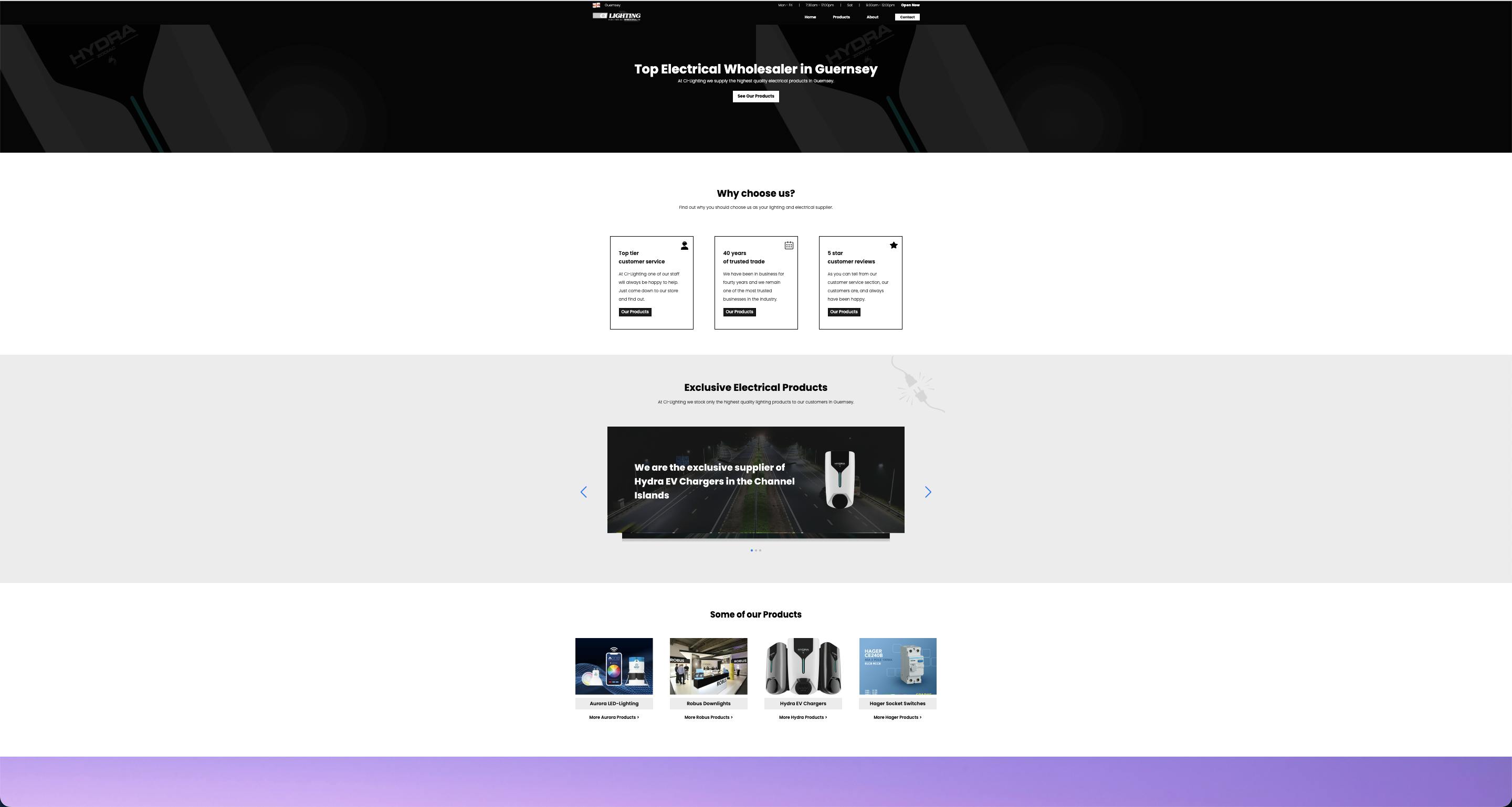
The website had now been live for a week or so and luckily for me, the client wasn't planning to advertise until the new year. I was doing some research one day on best practices for the web, as like I said I didn't really have any experience with real, live websites and I heard somebody mention that I needed to test what the website looks like when the user zooms in or out on their browser, which is something I had never even thought of but I realised was very important. So I zoomed out my browser and was surprised by what I saw.
I had always been taught that a key design fundamental is that on bigger screens you should always have a container with a max width to stop your content from spreading out too far and making it more difficult to read, a design principle I still always follow as I believe it to be the best approach.
To the best of my knowledge, this is what I had done, but I had never considered zooming in or out when thinking about this so I wasn't even aware this was an issue.
I had become fairly familiar with using vw as the font size for the h1 whenever I designed a centred hero layout just to make things a bit easier when it comes to mobile screen sizes. Now without taking into account the zooming in or out, on paper, this seems to be a reasonable approach, I mean the website looked fine.

That is until I zoomed out and I was horrified by what I saw. Worst of all, I had no idea why it was doing that.

All I could think was, "Why the heck does it look like that, my container had a max width so everything should be contained to its normal size even on zoom". Also "Why the heck was my background repeating, this isn't how I pictured it looking and there isn't any reason why it should look that way," I thought.
I spent absolutely ages playing around with things trying to fix the issue when all of a sudden it hit me, the viewport width measurements, although the screen had not got any bigger, the perception of the screen had due to being zoomed out.
Now I always use rem for my font sizes, or maybe a bit of min or max if I need that responsiveness.
I would also like people to consider the same with viewport height, as in my experience if you have say a tablet with a tall screen, all your measurements are going to be thrown off using viewport height as a measurement.
I hope people reading this have learnt something and hopefully, I can prevent other people from struggling with this issue as I have. Here's what the website looks like zoomed out now, as you can see, the height of the hero section and the font sizes are now proportionate thanks to not using viewport measurements.
I have done my best to explain this issue but I must admit I did find it hard to create an example and put it into words efficiently anybody who reads this will no doubt stumble across this issue at some point and upon experiencing it first hand, they will understand now how to fix it.
Thanks for reading.